CQUniversity Australia
A rebrand built to be used by everyone.
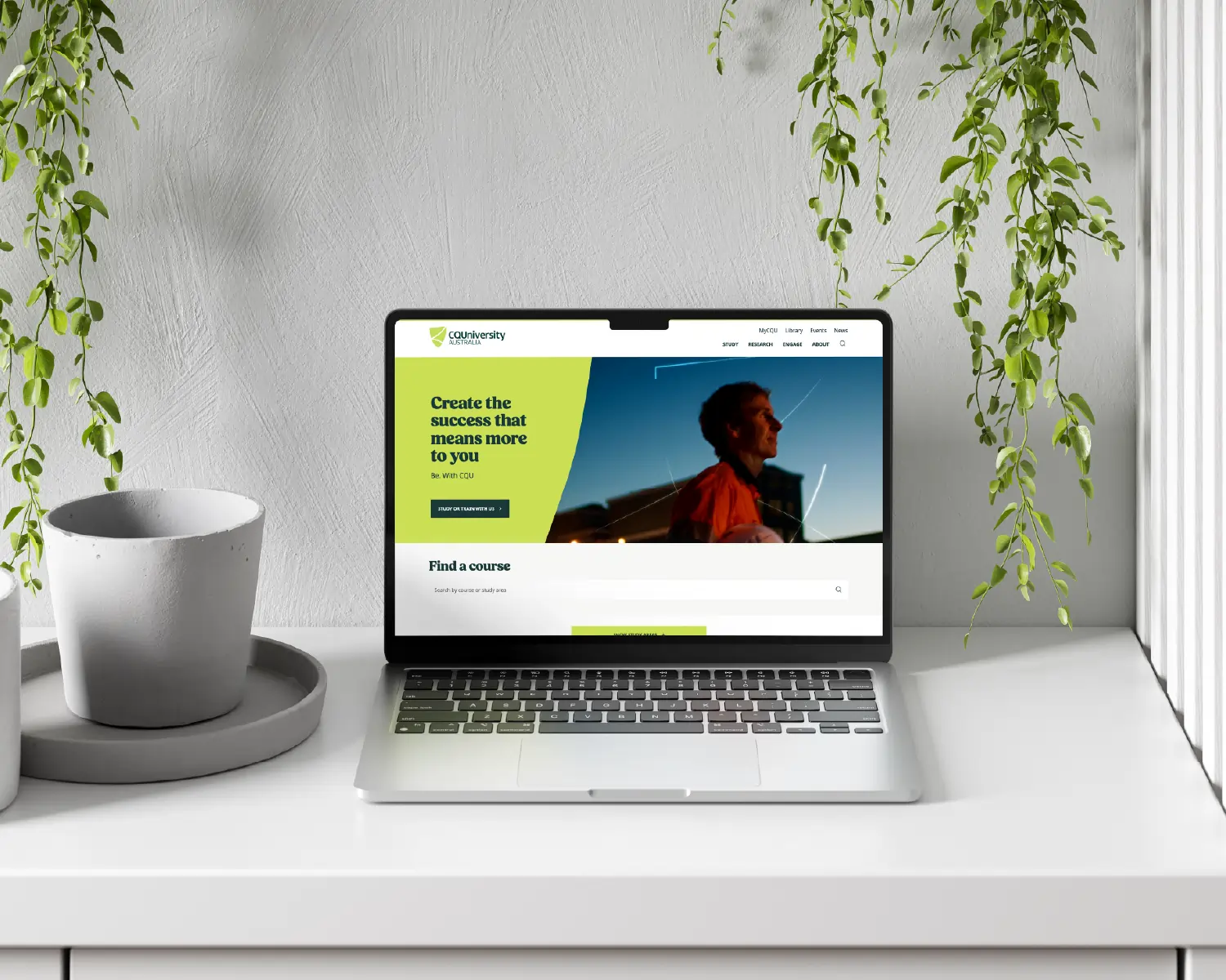
CQUniversity was rolling out a brand refresh, and accessibility was one of the new brand's core pillars. The whole site needed to be redesigned into the new look, and I designed it from the ground up, building the single, documented design system it had never had. It went live on brand and on time, and later won Education Website of the Year.
A different type of story.
A note on this one. This project sits a little differently to the rest of our work. It was led by Kat Price, founder of Upstart Lane when she was working as Manager, Web & UX at CQUniversity. Kat did the design and wrote the documentation and governance herself, working closely with CQU's in-house development and brand teams, who also supported testing. The story below is in her own words.
At a Glance
Organisation: CQUniversity Australia
My role: Manager, Web & UX (in-house)
Scope: Full corporate website redesign to the new brand, end-to-end Figma design system, accessibility, design reviews, governance documentation and a digital design guide.
Working with: CQU's in-house development and brand teams.
Live: January 2025
Recognition: WCAG 2.2 AA. Education Website of the Year, Australian Access Awards 2025.
The problem.
CQU's site worked. It looked good and did its job. But the brand refresh wasn't a colour swap, it was a real modernisation of how the university presented itself online, and with accessibility as a brand pillar, the new site had to deliver on it for real.
The hard part was where it started from. The designs the site was built on were spread across about a dozen Figma files at all different stages, some polished, some half-built, some no longer matching what was actually live. None of it was in the new brand, and there was no single, current source to design or build the rebrand from. The dev team was ready to go with nothing solid to work against, so that came first: designing the new site, and getting every component into one place.
The approach.
Three principles held throughout, so the work stayed pointed at what CQU actually needed.
01 - Accessibility in every component.
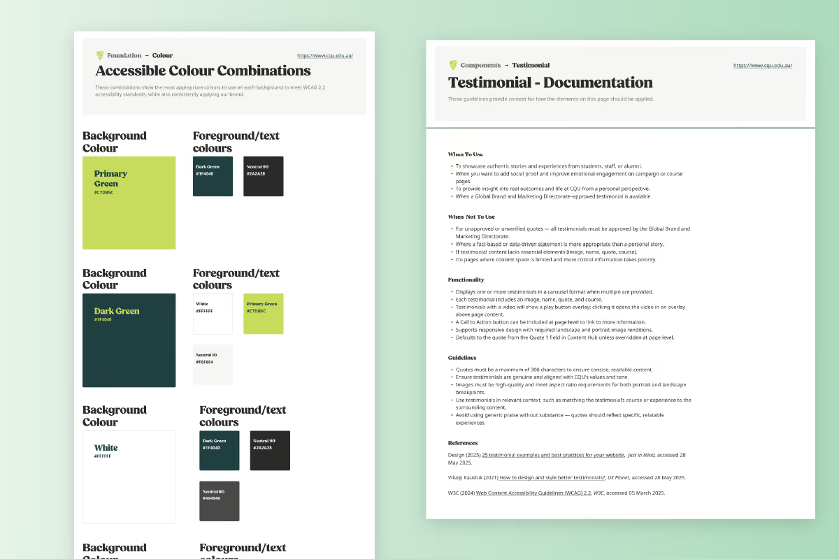
Accessibility was a brand pillar, so it couldn't be a final check at the end. Every element was redesigned with it front of mind, from colour and font choices to how each component behaved and responded, with research into whether each one was genuinely fit for purpose.
02 - One cohesive system.
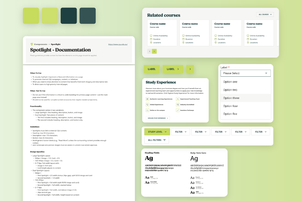
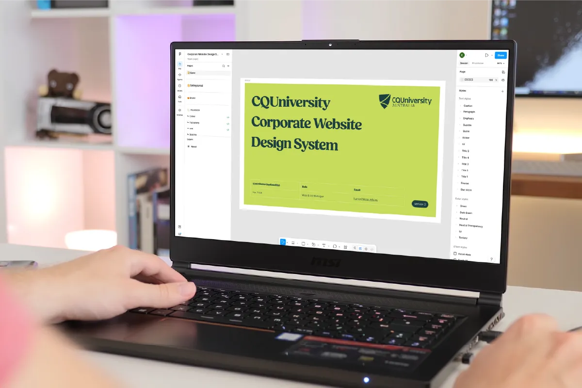
I worked through every element the site was made of, redesigned each one into the new brand, and brought them together in a single Figma file, 415 components in all, that became the design system. One place, consistent, and current, so the dev team had one source to build from.
03 - Document as I built.
Each component was documented as it was made: when to use it, when not to, how it worked, and the guidance around it. References were cited throughout to show the research and the thinking behind each decision. The system sat inside a wider Web Standards and Governance Framework I authored, so the rules for using it were written down too.
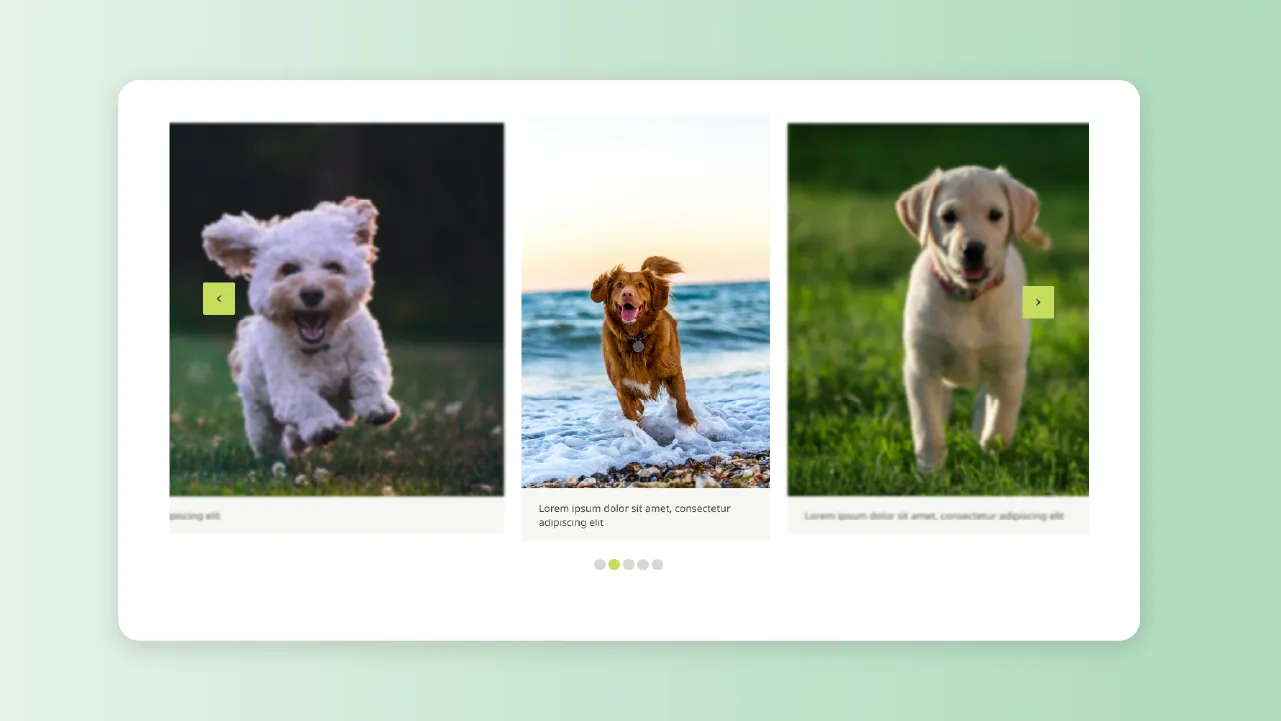
Designed for varied users.
It's easy to design for the person visiting the site and forget the person keeping it running. I designed for both. Every decision was weighed against the visitor's experience and the experience of the content editors who maintain the site day to day, and I made sure the two worked together rather than against each other.
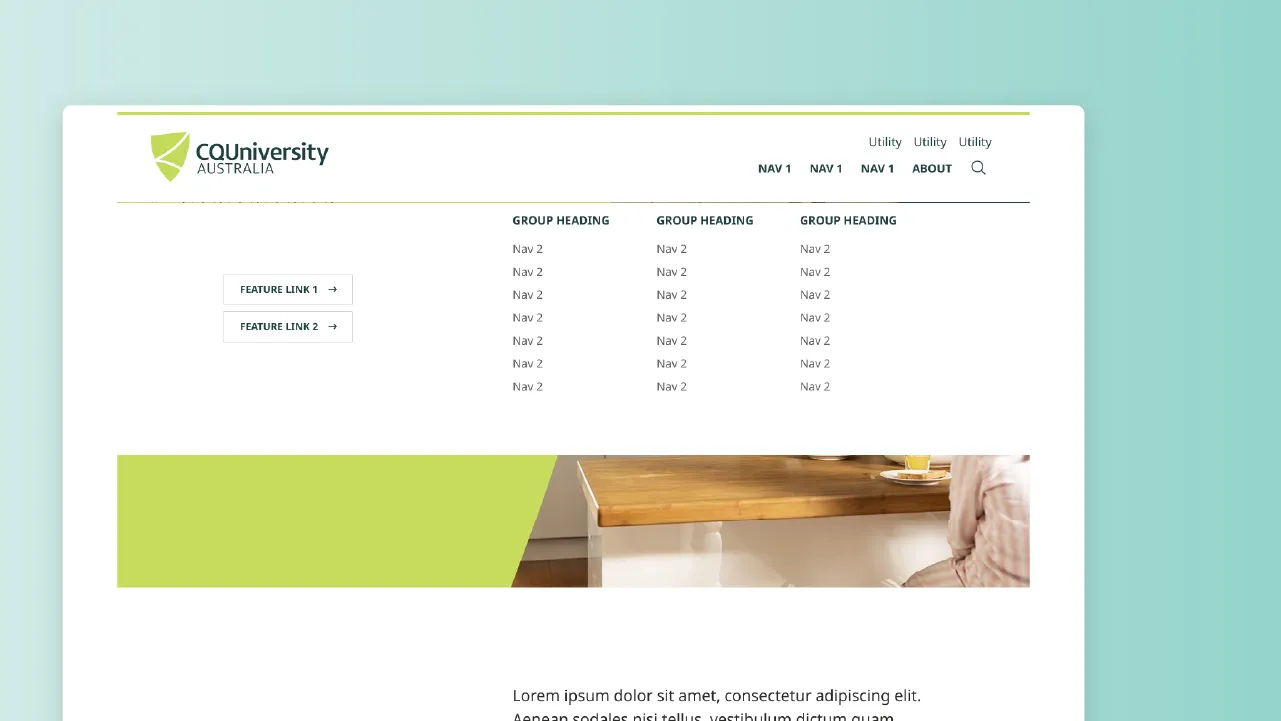
Kept what worked, improved what didn't.
The goal wasn't to reinvent how the site functioned. Functionality stayed largely the same, so the rollout wouldn't throw users or editors who already knew their way around. Where there was a clear chance to make something easier to use or more accessible, I took it, but as considered tweaks, not change for its own sake.
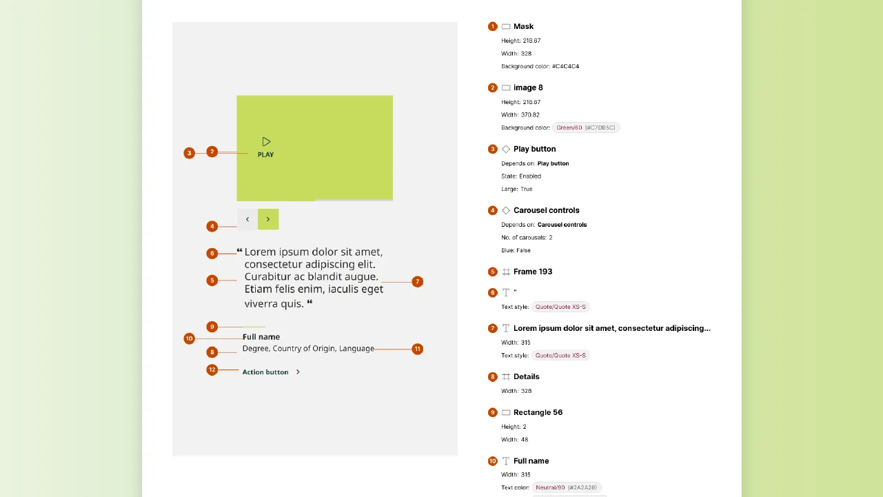
Reviewed pixel by pixel.
I led the team through extensive design reviews, checking the work pixel by pixel so nothing slipped through. We tested across devices and worked closely with the developers, raising tickets for every defect so they were tracked and fixed rather than lost in the shuffle. Early on we also brought in an external product designer to review our approach with fresh eyes, which sharpened a handful of components and helped bolster the shape of our design system.
Close to the build, and the brand.
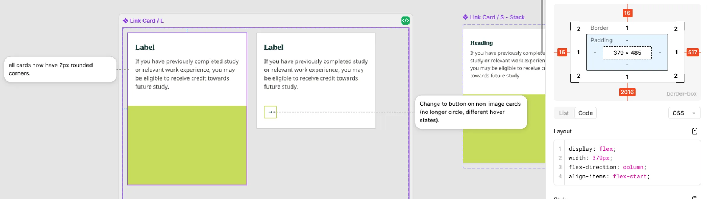
I worked hand in glove with the lead developer, going through designs together and adjusting them to suit what would work best in the build, while keeping everything on brand and accessible. The developers worked in Figma's dev mode and left comments right on the designs to ask questions, so calls got made in context rather than over a fence.
The brand team enjoyed it too, and I think that went both ways. I know the CQU brand inside out, but I also understand the customer and the marketing behind it, so every decision got weighed against the bigger picture and how it all fits together, not just how one component looked on its own. That's what keeps a rebrand coherent: one person holding the brand, the build and the customer in the same head.
Feedback from the Dev Team
The developers called it one of the best design collaboration experiences they'd had, because they could engage directly with the designer rather than interpret a static handover.
The Constraint
A deadline that wouldn't move.
The new brand was going live in January 2025 with paid media already booked, so the site had to match it on day one. There was no moving the date.
Getting every last thing to full quality in that window wasn't realistic, for me or the dev team. So rather than rush it, we made a deliberate call: launch on brand and on time, with forms as the one planned exception. For go-live the forms took the new fonts and colours so nothing looked off-brand, but they hadn't yet had the full design review and accessibility work the rest of the site had. Everyone was happy with the plan. We finished the forms as a short phase two first thing in the new year, gave them the same treatment as everything else, and then called it done.
Beyond the Website - THe Digital Design Guide
One system, more places to use it.
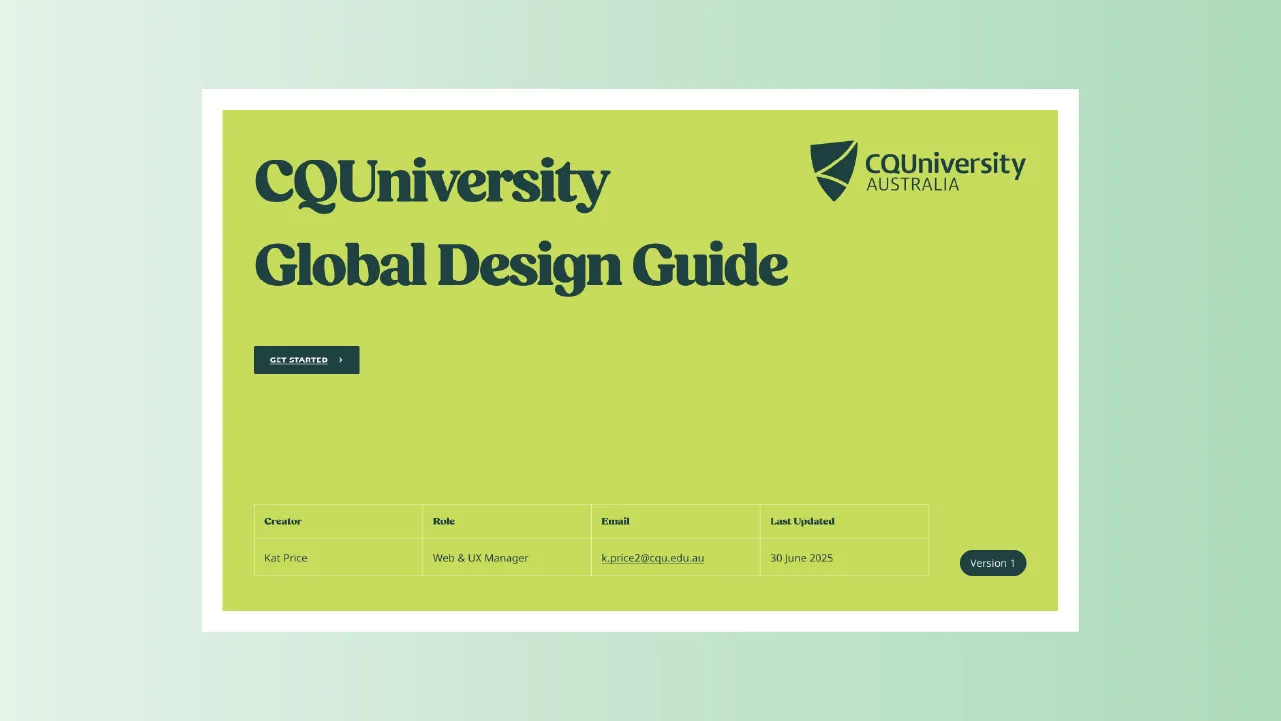
The website design system solved the website. But the brand needed to show up consistently everywhere else too. So I created a Digital Design Guide, taking the key elements from the website's design system, colours, fonts, buttons and the like, into a reference other teams could use when rebranding their own systems. The website became the source the rest of CQU's digital could follow.
The Result
Where it landed.
The new CQUniversity site went live on a design system the in-house team could actually maintain and still use to this day. After go-live, the site went through an independent accessibility review, and once a handful of flagged issues were fixed, it met WCAG 2.2 AA.
Then the work picked up a national nod. CQUniversity was named Education Website of the Year at the Australian Access Awards 2025, recognised specifically for its accessibility. The combined design and development effort is what got it there.
The best measure wasn't the award, though. It was that the site was accessible to the people who needed it, and set up so the team could keep it that way.
"Working with Kat Price on the rebrand of the CQUniversity website was an absolute pleasure. Her creative vision and strategic approach brought a fresh and modern identity to the website. Kat's commitment to accessibility was especially impressive, she ensured that inclusive design principles were embedded throughout the designs. She also collaborates seamlessly with developers, translating complex ideas into clean and simple designs. Her professionalism, responsiveness and eye for detail made a significant impact on the success of the project. I'd highly recommend Kat to anyone looking for a designer who delivers exceptional results."
Jon Hoff · Deputy Director Student Engagement Platforms, CQUniversity Australia