CQUniversity Australia
New design for student system.
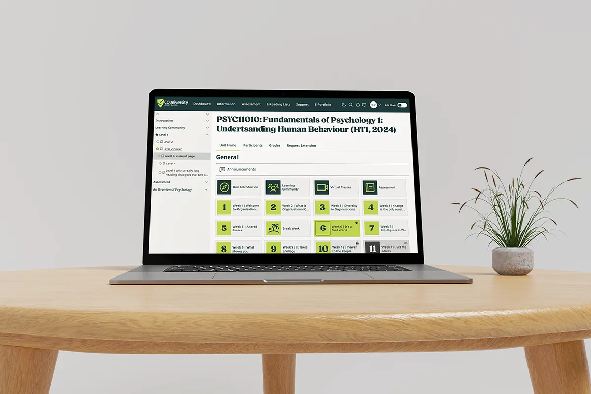
Moodle is CQUniversity's learning management system, the platform every student logs into, and where a lot of teaching staff spend their days. For all that use, it had never had dedicated design. It had grown on the fly, decision by decision, and it showed. We worked with CQU's developers to change that: to bring Moodle into the new brand, design it on purpose around the people who actually use it, and make it genuinely accessible, with WCAG 2.2 AA front and centre rather than checked off at the end.
The brief.
Moodle is one of the most-used systems at CQU. It's the LMS students rely on to find their courses, submit work and keep up, and that staff use to run their teaching. Despite that, it had never had a dedicated design pass. It had been built up over time, on the fly, with choices made in the moment rather than by design.
The developers knew it, and wanted to be intentional this time rather than ad hoc. Moodle had to come into CQU's new brand, and it needed real design behind it: shaped around how students and staff actually use it, and built to work for all of them. For a platform the entire student body relies on, accessibility wasn't a nice-to-have, it was the whole point.
At a Glance
Client: CQUniversity Australia
Product: Moodle, the learning management system used by every student.
Scope: Product design and UX for the LMS, Figma designs, accessibility, a dark-mode design, and a rebrand to the new brand.
Accessibility: Designed to WCAG 2.2 AA
Working with: CQU's in-house development team who built it and rolled it out.
Design for the system everyone uses.
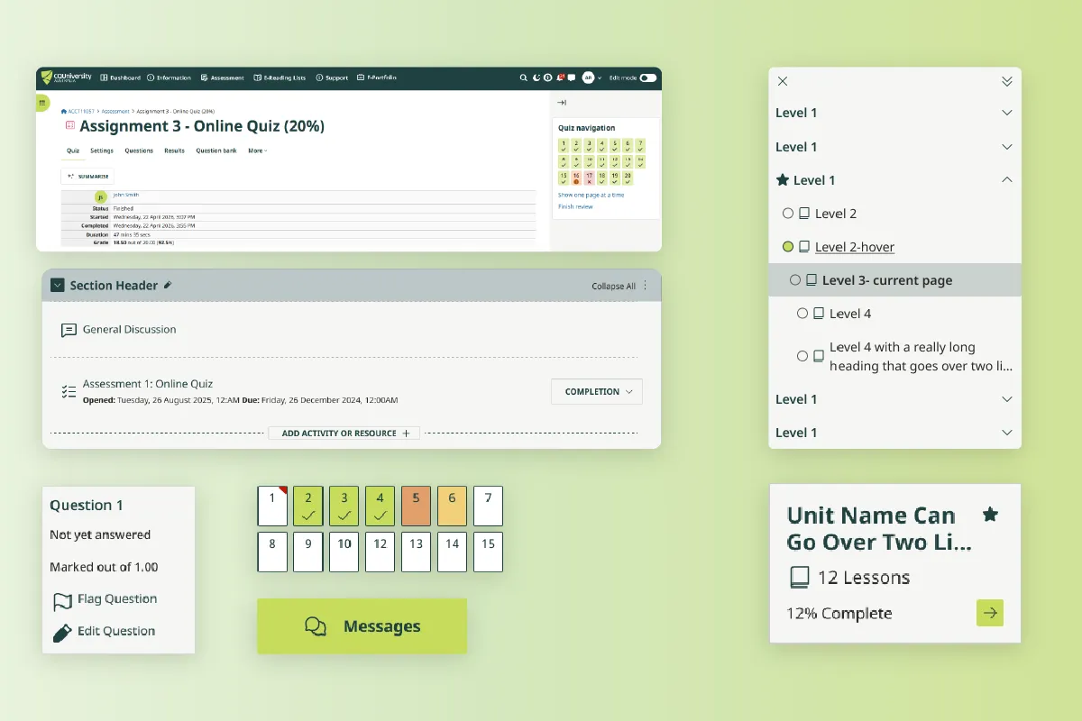
When a system is used by every single student, small design decisions add up fast. That's what made this worth doing properly. Rather than another on-the-fly tweak, we treated Moodle as the product it is and designed it on purpose: consistent and clear, built to a plan rather than assembled piece by piece.
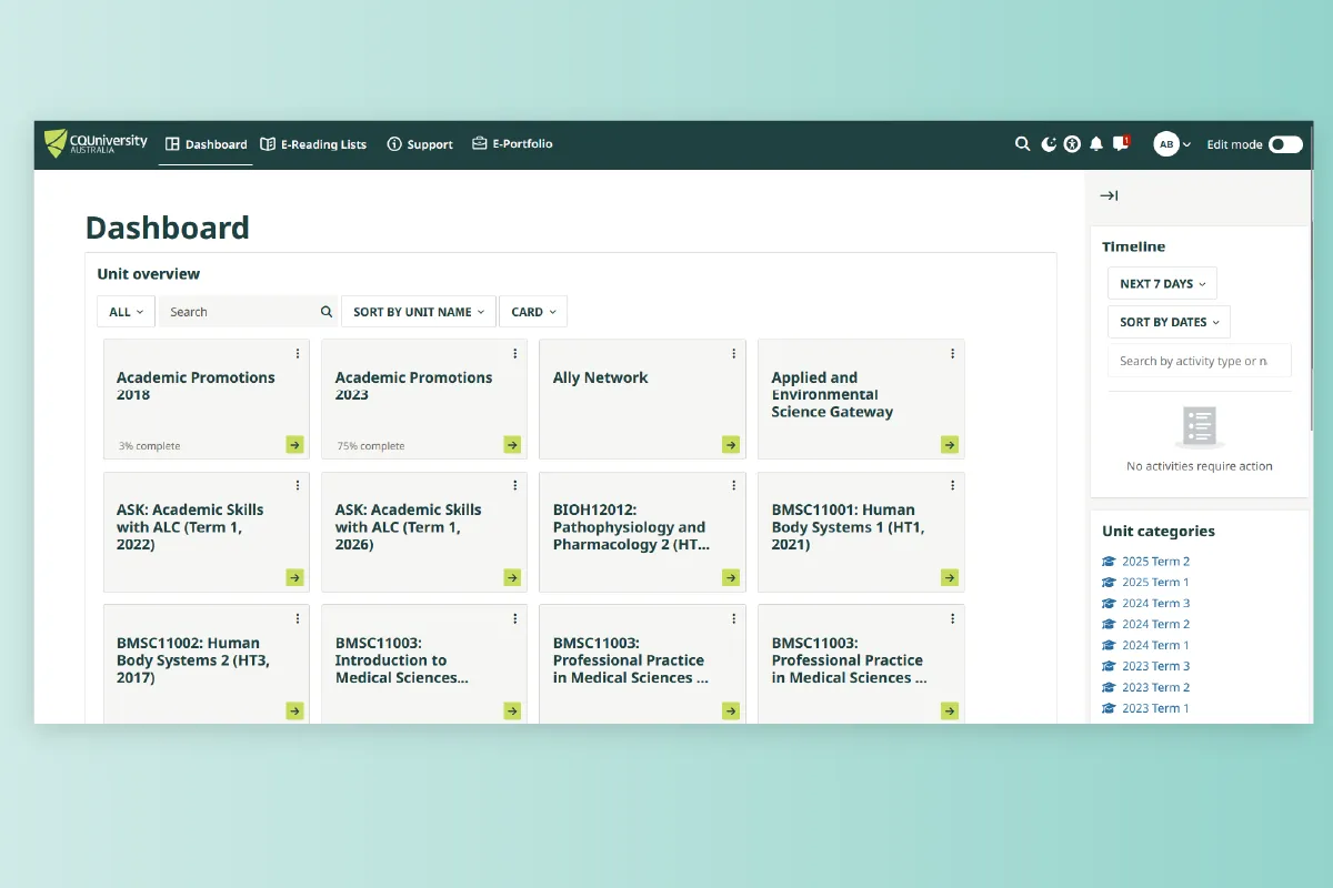
Designed around real pain points.
Good product design starts with the people using it, so that's where we started. We worked closely with CQU's developers to understand where Moodle was causing friction, for teaching staff and for students, and designed around those real problems rather than guessing. The result is a system shaped by how it's actually used, not just how it looks.
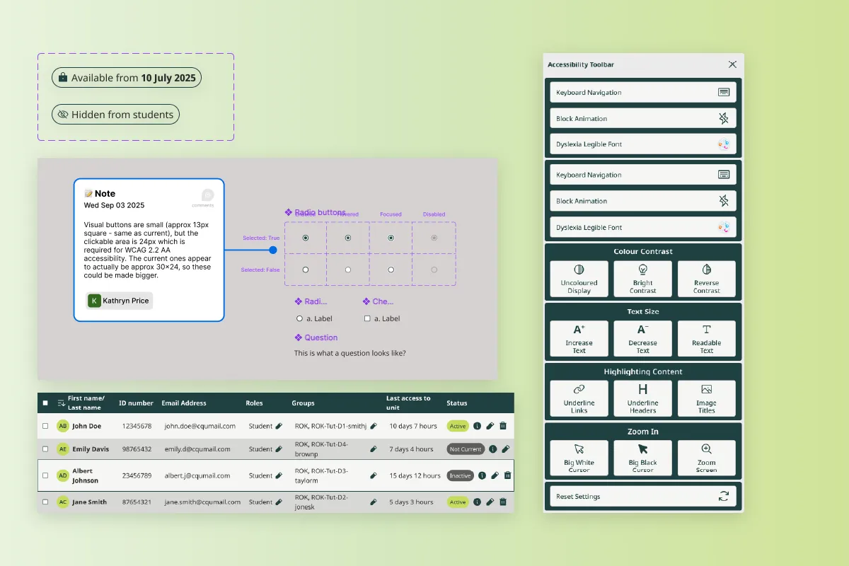
Accessible for every student.
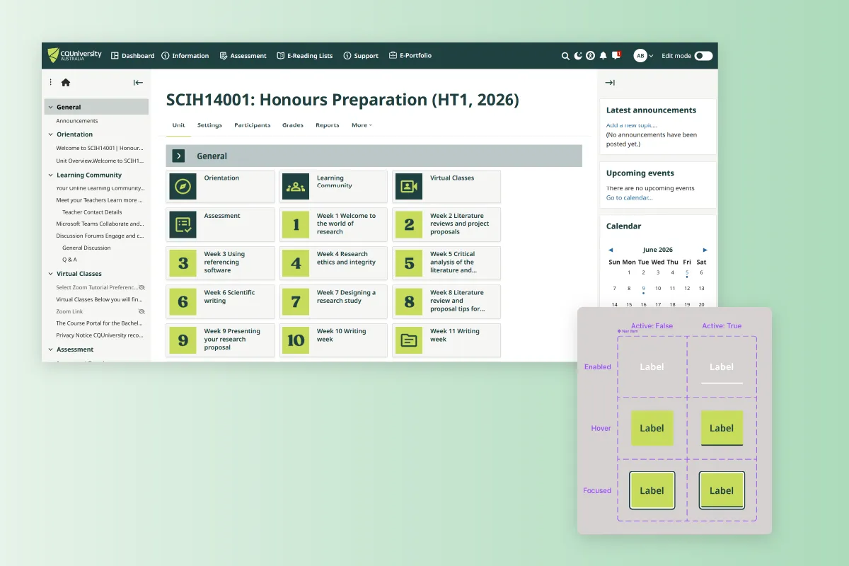
A system the whole student body depends on has to work for the whole student body, so accessibility led the design rather than trailing it. We designed to WCAG 2.2 AA from the first screen: colour and contrast, type and focus states, so students who rely on assistive tech, or just need clear contrast on a bad screen in bright sun, aren't left out. On a platform this widely used, that isn't a compliance exercise, it's a lot of people able to get their work done.
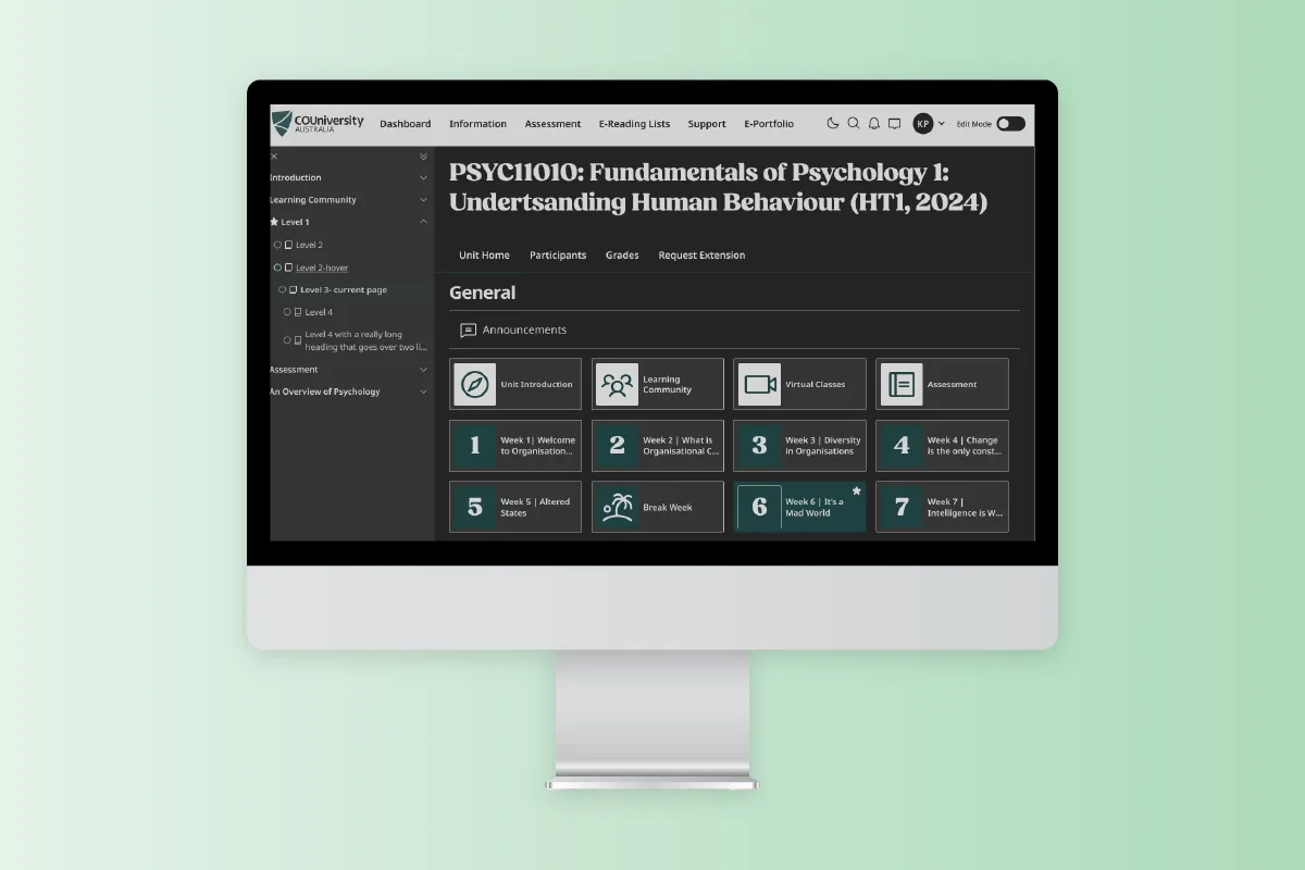
A dark mode, a first for CQU.
We also gave Moodle a dark mode, something CQU had never had in any of its design systems. It's easier on the eyes for long study sessions and late-night assignments, and it lets students use the system the way that suits them. Designing it properly, as a considered part of the system rather than an inverted afterthought, set a new precedent CQU can carry into its other products.
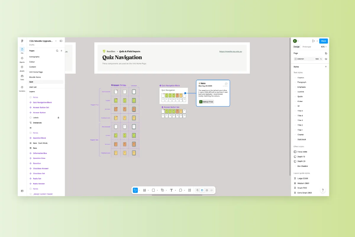
Build-ready, and on brand.
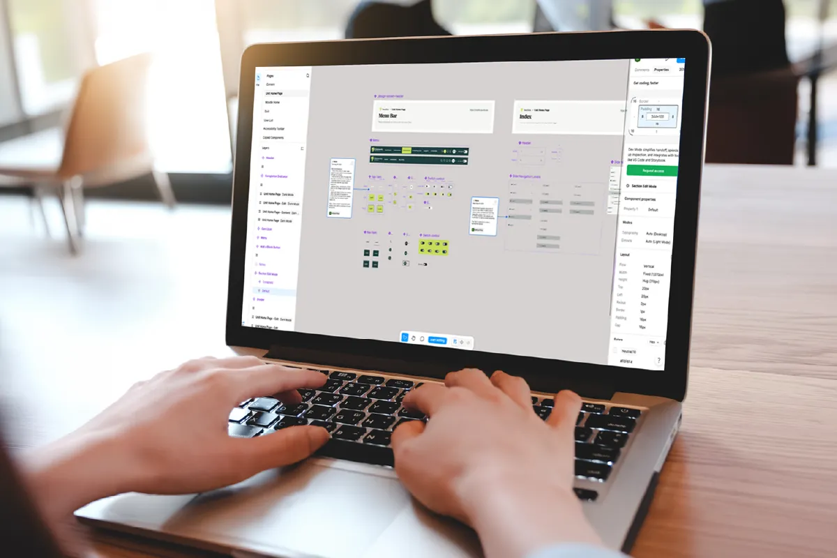
We prepared the designs in Figma, clear enough for CQU's in-house developers to take and build without a guessing game, which is exactly what they did, rolling it out themselves. And because this was part of the wider rebrand, Moodle came into the new brand at the same time, so the system students use every day finally looks like the rest of the university, not a leftover from an older era.
The REsult
Where it landed.
Moodle went from a system that had grown by accident to one designed on purpose: on brand, accessible to every student, and built around the people who live in it, students and staff alike. It picked up a dark mode along the way too, a first for CQU. For a platform every student touches, that's a lot of small improvements adding up to a better day, every day.